In today's fast-paced digital marketplace, providing a seamless shopping experience is crucial. This blog will guide e-commerce business owners and web developers on implementing the Quick View feature effectively. By understanding its benefits and functionality, you'll be better equipped to enhance user experience and drive sales on your online platform.
What is Quick View and How Does It Work?
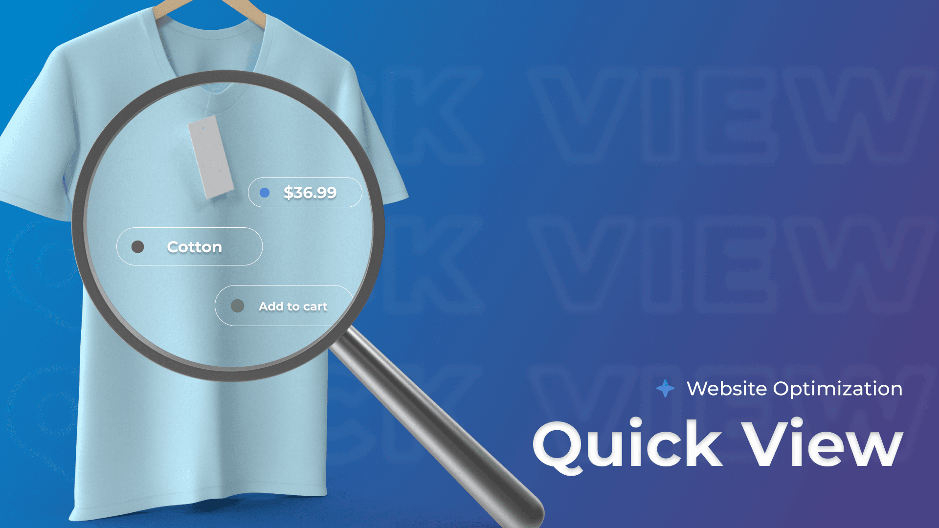
Quick View is a user-friendly feature that allows shoppers to preview product details without navigating away from the main page. By clicking on a “Quick View” button, customers can see essential information such as images, descriptions, and pricing in a pop-up window.
For example, an online clothing store might allow users to view an item’s details while browsing multiple products, making it easier to compare options and make decisions quickly.
How Quick View Enhances User Experience
Quick View significantly improves the user experience by reducing the time spent navigating between pages. For website owners, this means a more engaged audience likely to make purchases. Customers appreciate the convenience of accessing product information instantly, allowing them to compare items without losing their place in the shopping journey.
This streamlined process minimizes frustration and can lead to higher conversion rates, as users are less likely to abandon their carts when information is readily accessible.
Technical Aspects of Quick View Implementation
Implementing Quick View requires careful consideration of technical elements. Developers typically use JavaScript and CSS to create the pop-up functionality and ensure it integrates seamlessly with the existing design.
The feature should load quickly and be responsive across devices to enhance usability. Ensuring that product data is dynamically pulled from the database in real-time is essential for providing accurate information to users without delays.
Benefits and Drawbacks of Quick View
While Quick View is a popular feature that enhances the shopping experience, not all websites adopt it by default. Some businesses may prioritize a simpler design or lack the technical resources to implement it effectively. Moreover, there may be concerns about user experience, as a poorly designed Quick View can detract from the overall site functionality.
Advantages of Using Quick View
Streamlined Shopping Experience: Allows users to view product details without navigating away from their current page, enhancing convenience.
Increased Engagement : Encourages customers to explore and compare multiple products quickly, which can lead to longer browsing sessions.
Higher Conversion Rates : Easier access to product information can result in more items being added to carts and increased sales.
Mobile-Friendly: Optimized for touch interactions, making it a great feature for mobile shoppers who prefer quick access to product details.
Reduced Page Load Times : Quick View can minimize full-page reloads, leading to a more efficient browsing experience.
Potential Limitations and Drawbacks
Interface Clutter: Poorly designed Quick View features can clutter the user interface or distract from the main content.
Loading Issues : Slow loading times for the Quick View pop-up can frustrate users and lead to higher bounce rates.
Information Overload: Users may feel overwhelmed by having too many options presented simultaneously, complicating their decision-making process.
Preference for Full Pages: Some users may still prefer the comprehensive view of a full product page, which includes more detailed information and reviews.
SEO Concerns: If not implemented correctly, Quick View can create duplicate content issues or hinder proper indexing by search engines.
The Power of Quick View in E-Commerce
The Quick View feature in e-commerce began gaining popularity in the early 2010s as online retailers sought to enhance user experience and streamline the shopping process. Today, a significant number of e-commerce websites—estimated to be over 50%—incorporate this feature to allow customers to view product details quickly without navigating away from the current page.
This innovation reflects the industry's shift towards more user-friendly designs and the increasing demand for efficiency in online shopping.
Comparison with Traditional Product Pages
Traditional product pages require users to click through to view details, which can interrupt the shopping flow and lead to frustration. In contrast, Quick View enables customers to see product images, descriptions, and pricing information in a pop-up window, allowing for seamless browsing.
While traditional pages offer more in-depth information and can be beneficial for complex products, Quick View is ideal for catalogs with numerous items, where quick comparisons are essential.
Ultimately, Quick View suits websites aiming for a streamlined user experience, while traditional pages may be better for sites requiring detailed content and comprehensive descriptions.

